London Living Streets and London transport campaigners, London Cycling Campaign, CPRE London, RoadPeace, Sustrans and Campaign for Better Transport London have published a new scorecard that will measure London boroughs’ progress towards the Mayor’s Transport Strategy ‘healthy streets’ targets.
The aim is to publish the Scorecard annually to show progress year on year. But today’s publication already reveals gaps between the level of active travel in different boroughs and the efforts they are making to increase this. For example:
- 93% of journeys in the City of London are made by walking, cycling or using public transport. But this is as low as 41% in Hillingdon.
- Hackney has installed 84 “modal filters” to create low-traffic neighbourhoods, Kensington & Chelsea only two.
- Some boroughs have almost 100% coverage of 20mph zones. In others it is less than 10%.
This is not simply a story of Inner London beating Outer London boroughs that are disadvantaged by lower public transport accessibility and lower housing density. Outer London boroughs, such as Waltham Forest, are bucking the trend, with significantly more modal filters and protected cycle lanes than neighbours. As a result, the data shows Waltham Forest also has one of highest rates of walking in London.
Some Inner London boroughs are lagging behind their neighbours on the move towards healthy streets. Kensington & Chelsea, for example, has just two “modal filters”, compared to 84 in Hackney; less than 1% of its roads covered by 20mph limits, and one of lowest boroughs for length of protected cycle lanes.
London boroughs are central to the delivery of the Mayor’s healthy streets targets and there a number of measures they can bring in right now to achieve dramatic results in terms of improving health and activity, reducing danger on the roads and helping the environment.
The Scorecard shows some progress in implementing these measures, but boroughs have to do far more to reduce car usage, charge for parking properly and get more people walking and cycling.
The London Boroughs Healthy Streets Scorecard report (which contains charts for each indicator) is available here.
The spreadsheet with full data set is available here.
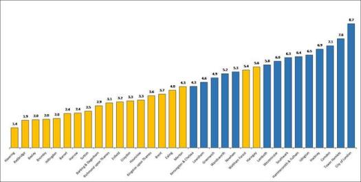
The chart illustrated above shows the London Boroughs Healthy Streets Scorecard Overall Scores for 2019. The YELLOW are Outer London boroughs and BLUE Inner London. The overall scores were derived by combining scores from the eight individual indicators.
